This is the performance made by 3rd A, B and CD on November 25th, International Day against Gender Violence.
Thanks specially to Marta de Gonzalo, my friend and Arts Department Head.
This is the performance made by 3rd A, B and CD on November 25th, International Day against Gender Violence.
Thanks specially to Marta de Gonzalo, my friend and Arts Department Head.
Jorge based on several texts as The Chatcher in the rye by J.D Salinger and Keep on keeping on by Michael Sage. What he wanted to represent above all was perseverance and the idea of sticking to the things you like and enjoy doing in order to accomplish your goals; success based on honest intentions, humbleness and effort.
Certainly it is a project very thought and planned. Look at his sketches as well:


Ana Venteo got inspiration from one poem by Mario Benedetti and an anonymus sentence. Mario Benedetti’s is in the picture:
“Nos enseñaron desde niños cómo
se forma un cuerpo sus funciones sus sitios
pero nunca supimos
de qué estaba hecha el alma”.
The second one was also related with the soul: ” The sun sees your body, the moon sees your soul.” That’s why she painted a night landscape, because for her, at night, you are more “pure” and sincere with yourself and everything.
She chose this topic because it is a mistery but although not having a scientific explication, we know that there’s something in ourselves. That’s why she wanted to represent a soul. A soul in peace.
She had a lot of difficulties: how to represent a soul, or how to seem depth and with the aereal perspective… But fake it till you make it!

Guillermo Guzmán’s project is very complex because he talks us about “Lazyness” for knowing people and no judge them for the first gist, limits of sexuality and gender.
He shows his images in a spectrum, one close to the other, like an evolution.


 This is the barrier we puts.

After going to Roni Horn’s exhibition we were working in a personal project: free technic to show us something about you, your thoughts, your worries… to move us.
The results have been very varied and interesting. Here there are some examples of them:
Candela wanted to connect teenagers with technology and school. She took four photos where you can see a mountain of books and at the top a technological device. This means that teenagers use more technology than books for searching things that they don´t know. She has also put them in the order that they were invented.


Claudia’s project is an installation made for children or young people mostly. The mirrors represent the future in a subjective way, because it let them imagine what would they want to be, without being scared of what people can think about it, Some people work at something they don’t like, because they don’t have other option, but when you are studying you have to do what you want, for your dreams can become true.


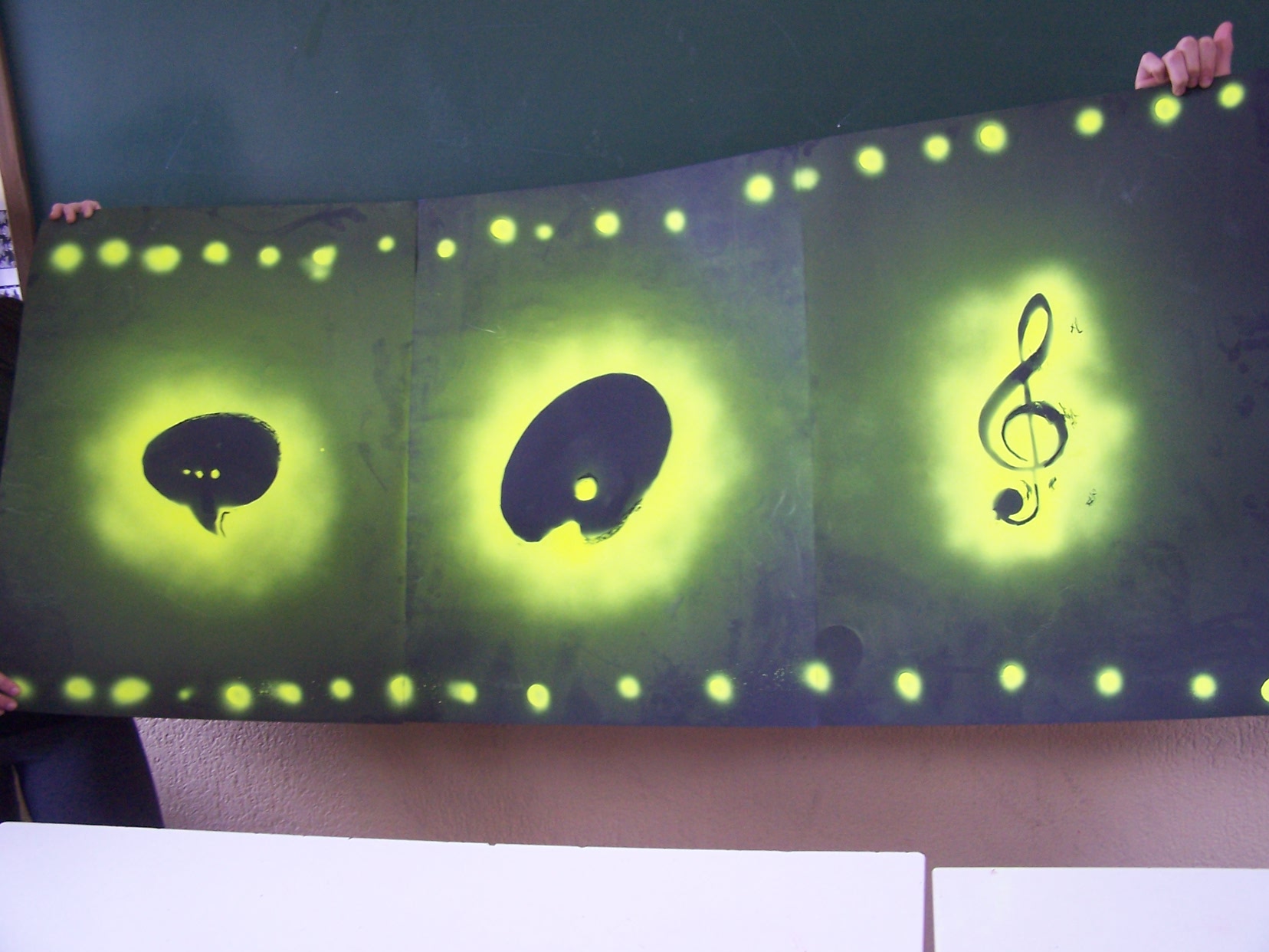
Pelayo’s project consist in represent his hobbies with iconic symbols: a balloon wich shows that he loves chatting and giving his opinion, a painting palette wich tells that he loves painting. And finally a bass clef which represents his love for music and playng instruments. He decided to use fosforescent painting to show the strength of his personality .
Raquel has done a wave because she wanted to show how important is Vigo for her and I thought that the sea was the best way. The wave is made up of pictures of all her life representing when she was little and she lived there, but with the pasage of time she is further from there. The base of the wave represents her childhood, the foam the future and the end the death.

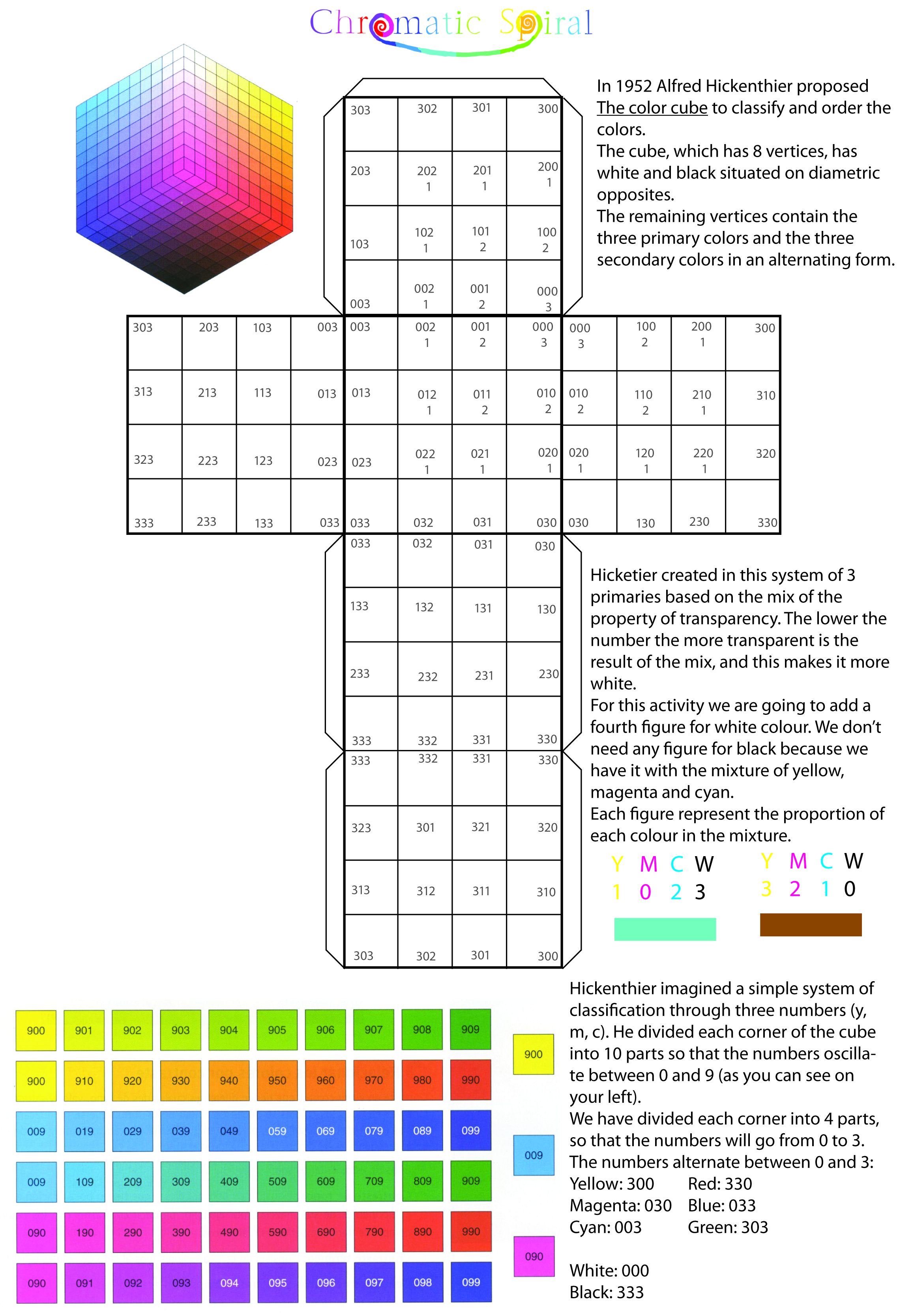
One of the exercises for colour lesson is Hickethier cube. Here it is the diagram (based on Laslaminas):
Do you want to know more about colour and its history? Visit coloursystem
Here they are! I know that it is a little late, but better late than never.
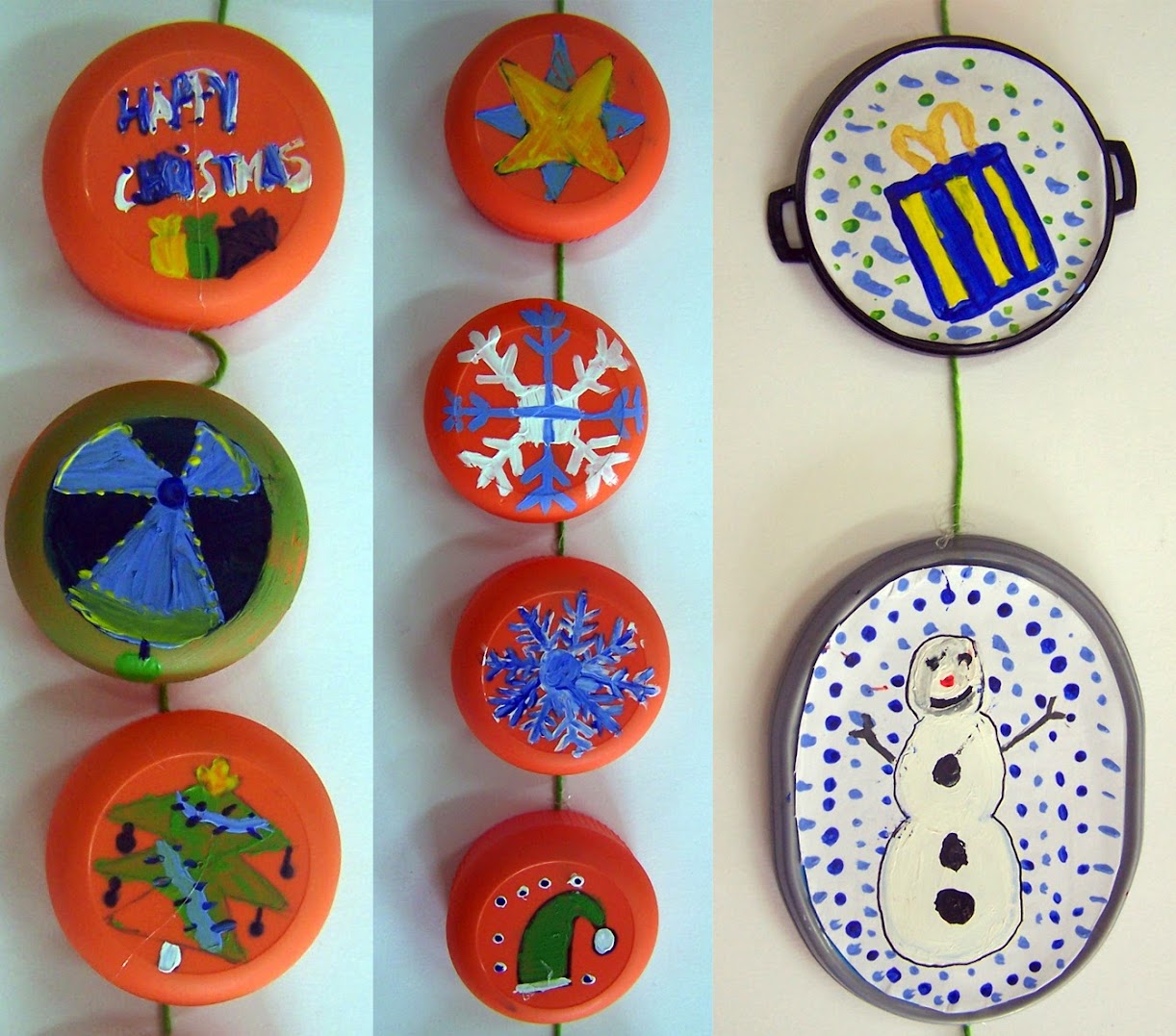
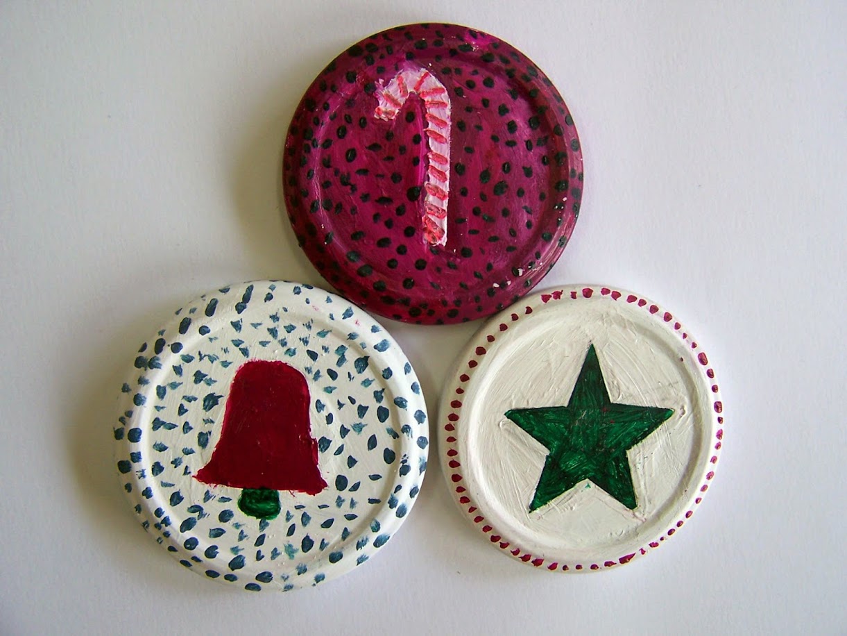
This year 3rd ESO pupils have been doing christmas ornaments with recycled material: jars caps. And the results have been interesting.
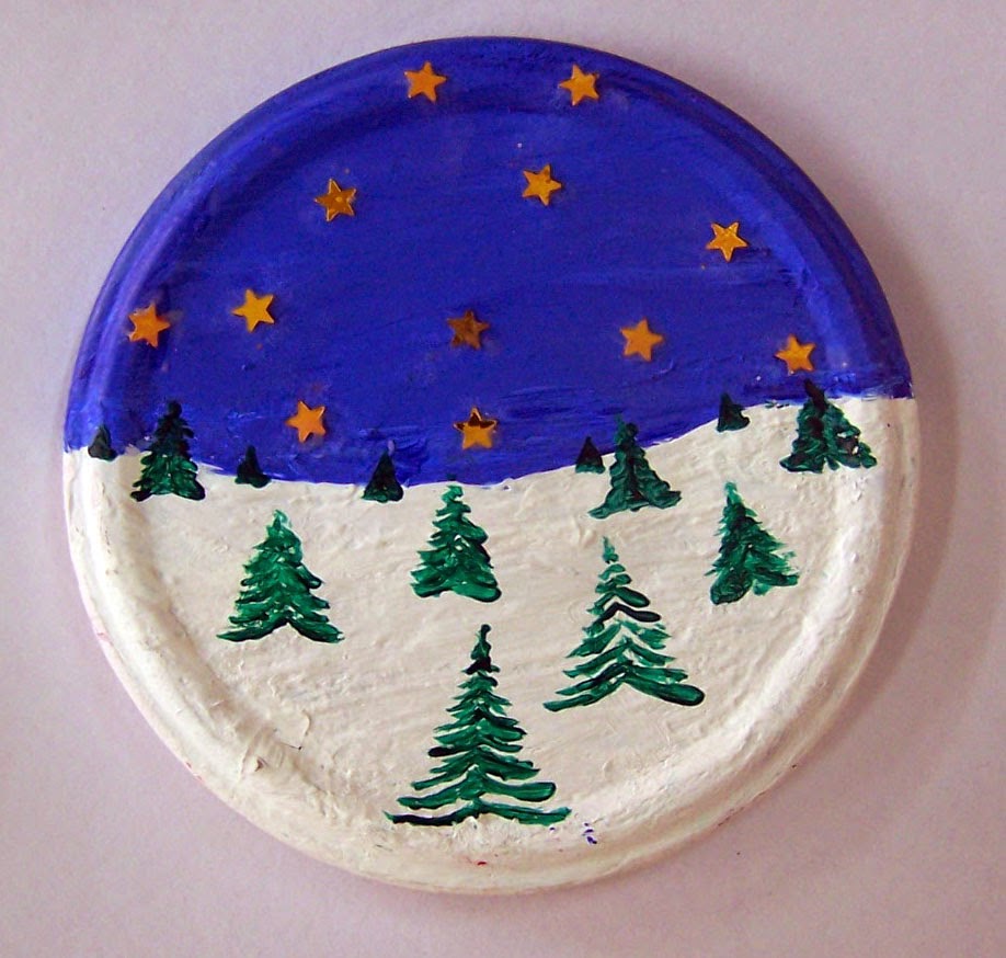
Alberto has combined paint and sticky stars to make a snowy landscape. That day on the lesson I explained to him about aerial and lineal perspective in order to create depth. Well done!
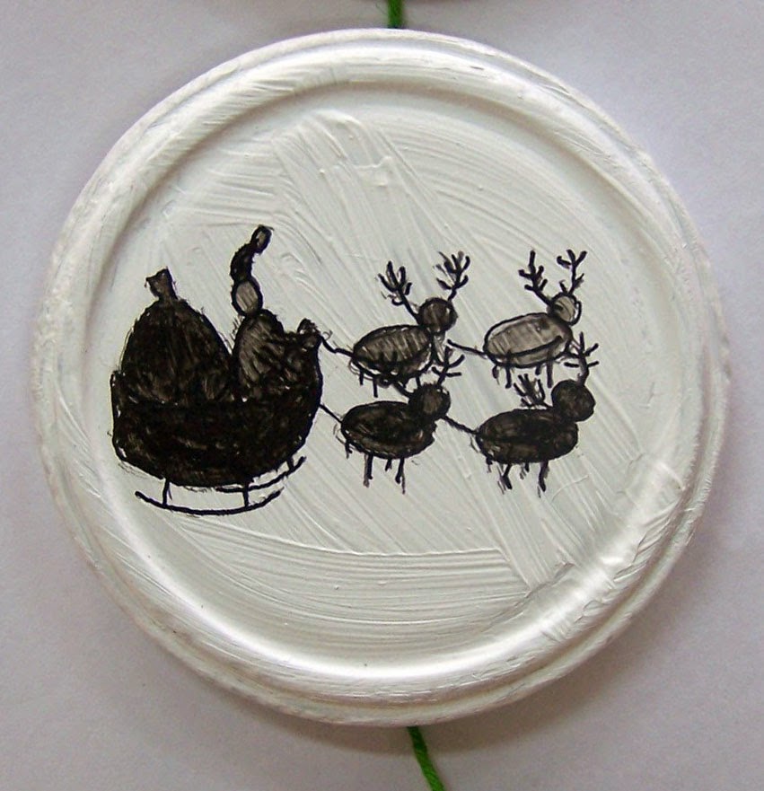
Claudia has drawn the silhouette of the classic sled with presents, reindeer and Santa Claus. Simple and effective.
Andrea has made a composition with several kinds of caps, taking advantage of their different shapes and colours of them. Very good!
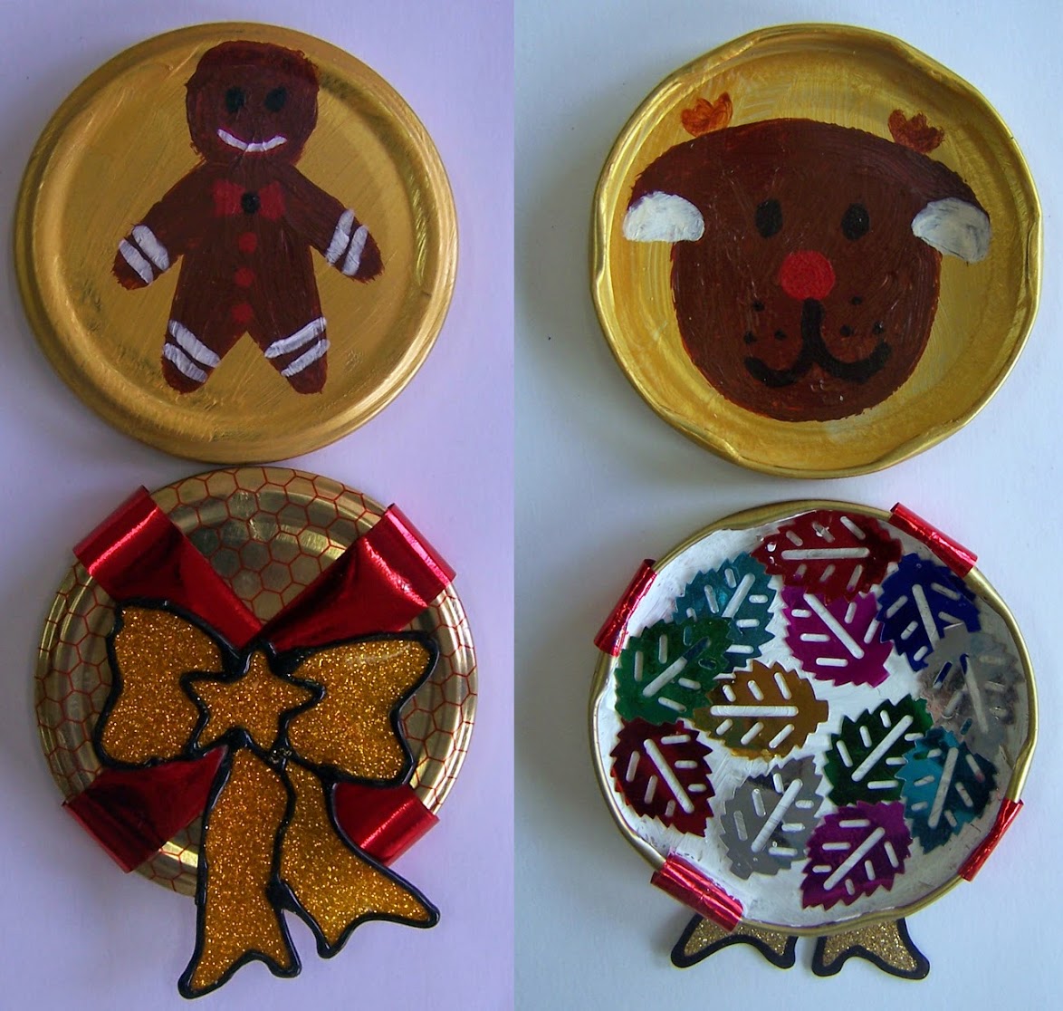
Emma has painted both faces of the covers with a gingerman, Rudolph, a pretty ribbon and some sticky leaves.
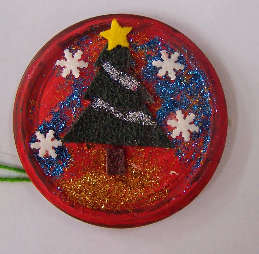
Laura has made the fir tree but with a scrubber! Great idea to imitate even the texture of the branches. Glitter and stars are good materials for this composition.
Lucía has used another kind of paint. I think it is some kind of nail polish. The shine obtained is very elegant. Her work is always very delicate and with good taste.
Raquel has made three jar covers with an interesting range of colours which combine very well among them.
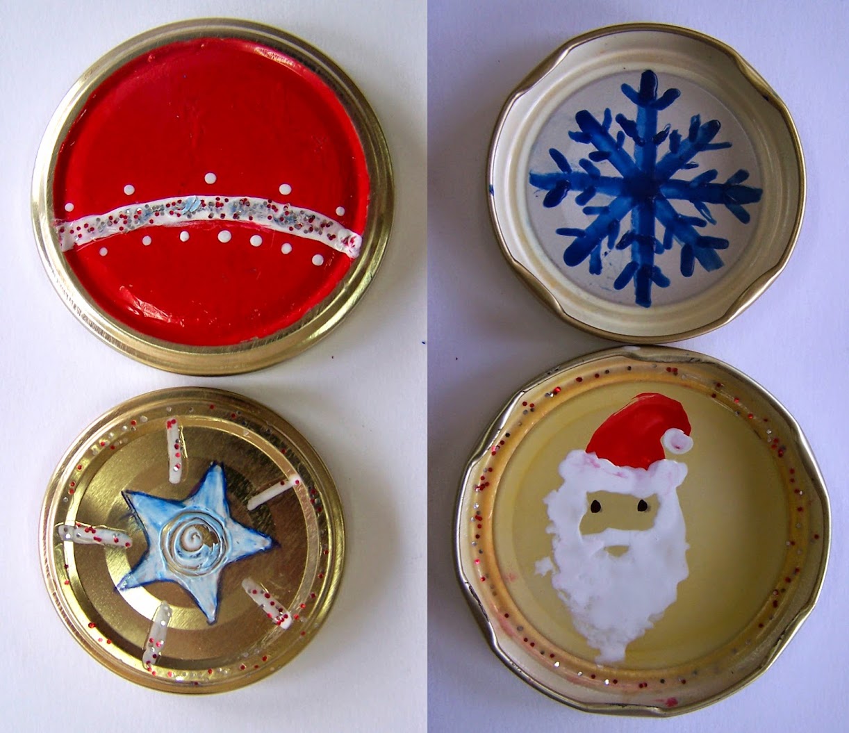
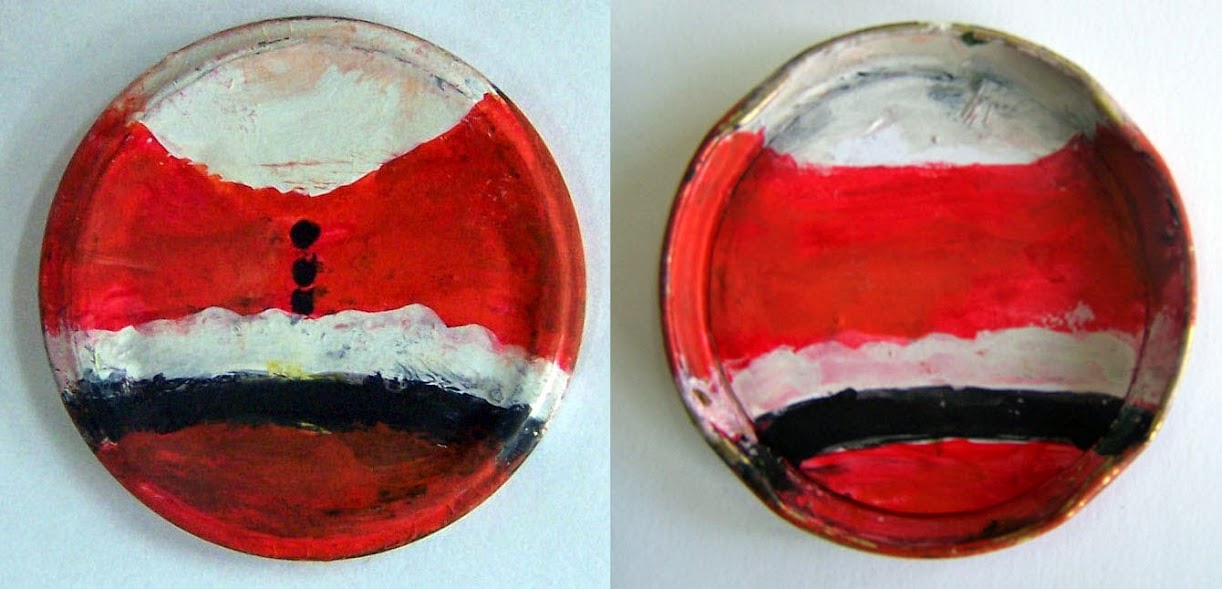
And to finish one of my favourites because it is very very conceptual. Tomás has represented the essence of Santa Claus only with a fragment. It is the part of the bottoms, the belt and the beard in front and the back in the opposite face. He didn’t wait for the paint to dry and this could have been a problem at first. But the final result in this case is very rich because the colours match so well.
And these are some of the results:
Every November 25th we celebrate International Day against Gender Violence.
We are going to work a little about the issue reflecting on several posters from Jornadas de Diseño Motiva (Gijón, 2004). These posters are magnificent and I would like you think about them. What are they saying to us? Choose your favourite and leave a reply about it: what the message is, what kind of visual elements use to express it, why you has chosen it…
 You can see them here.
We are going to comment the lyrics of these songs:
Love the way you lie by Eminem ft. Rihanna
Behind the wall by Tracy Chapman
Luka by Suzanne Vega
And finally: make up a mask as attacker or as attacked to do a photo-performance.
